Data Visualization Portfolio
This page showcases a few of the visualization projects I've worked on over the years that I'm most proud of. Most of them are full layouts which are meant to stand on their own, but for those which need additional context, a description is provided below the image.
It appears that you're on mobile right now. I recommend viewing this page in portrait mode, as the text descriptions may become cut off in landscape mode. However, landscape mode can be used to enlarge visualization images without zooming.
A condensed version of this portfolio can be accessed through
this link.
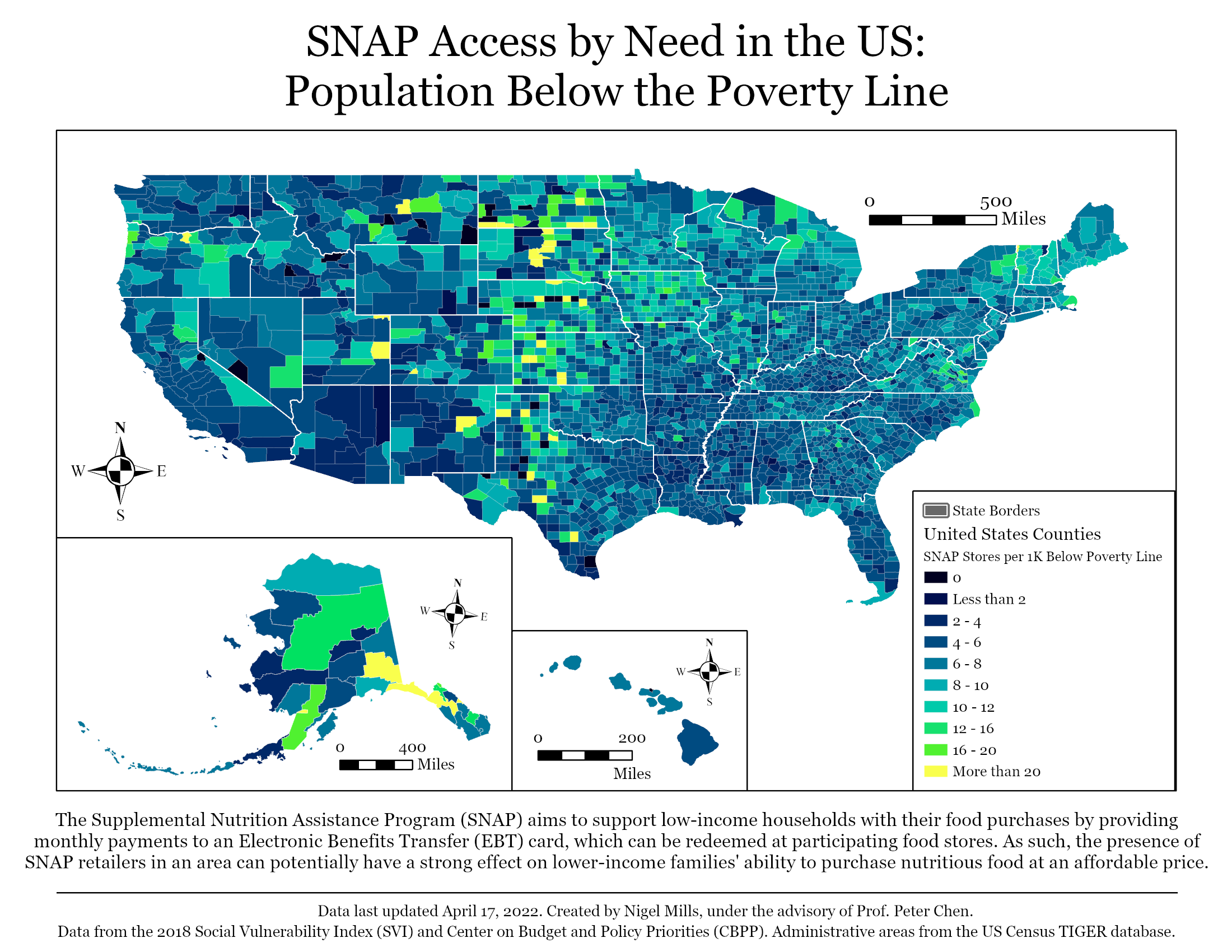
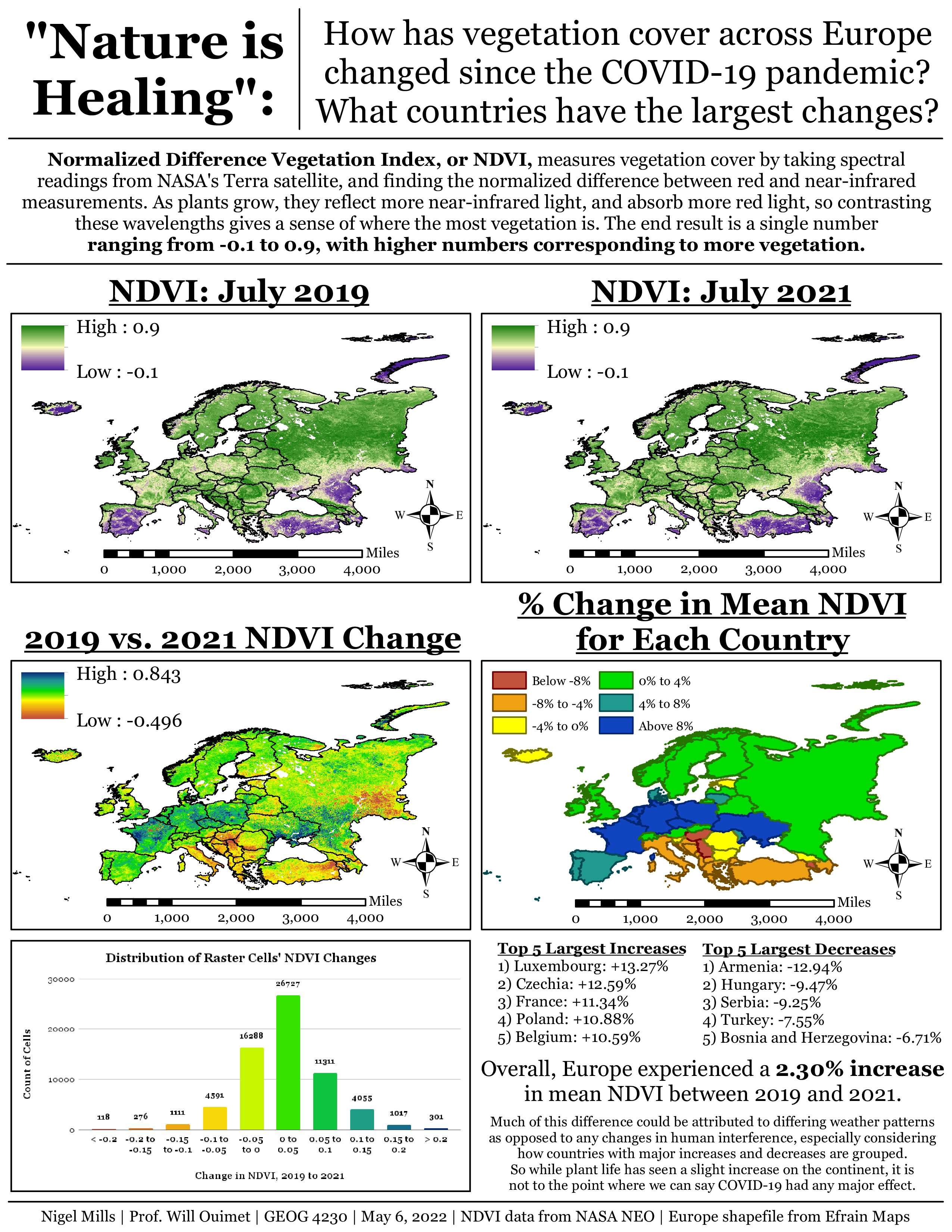
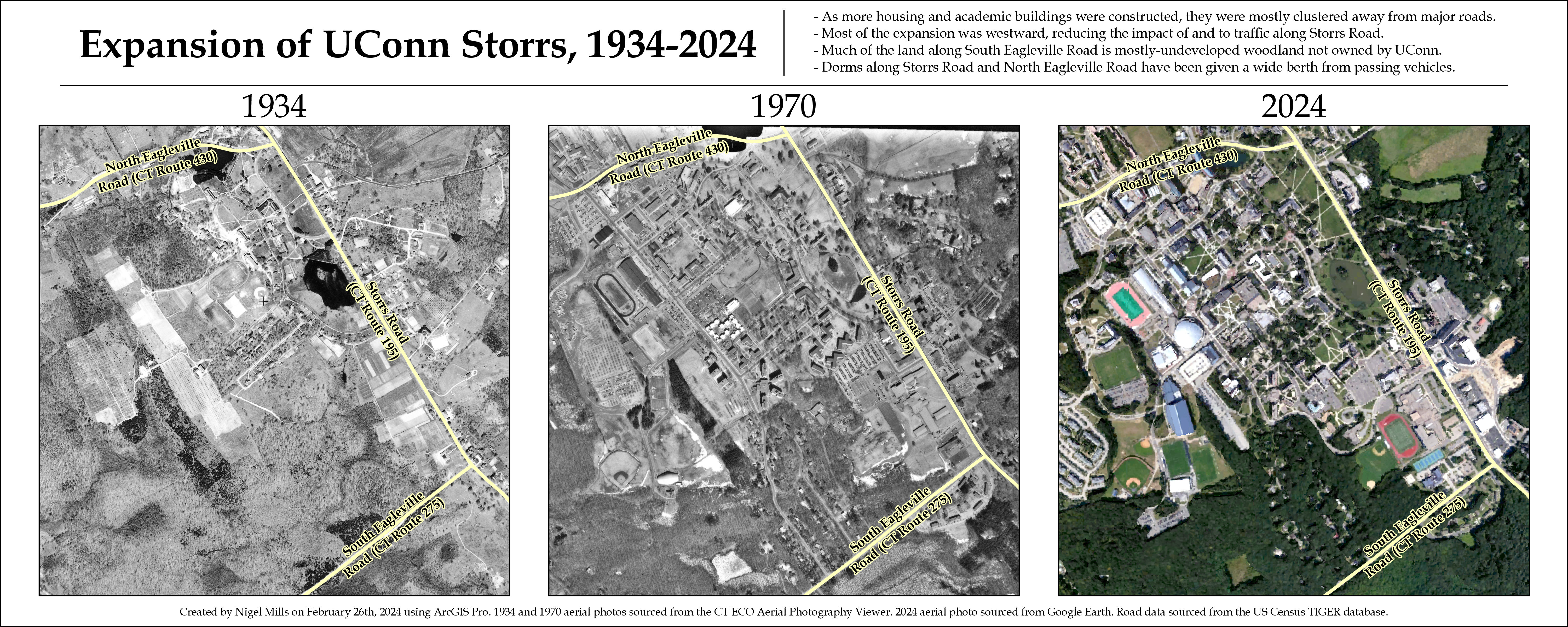
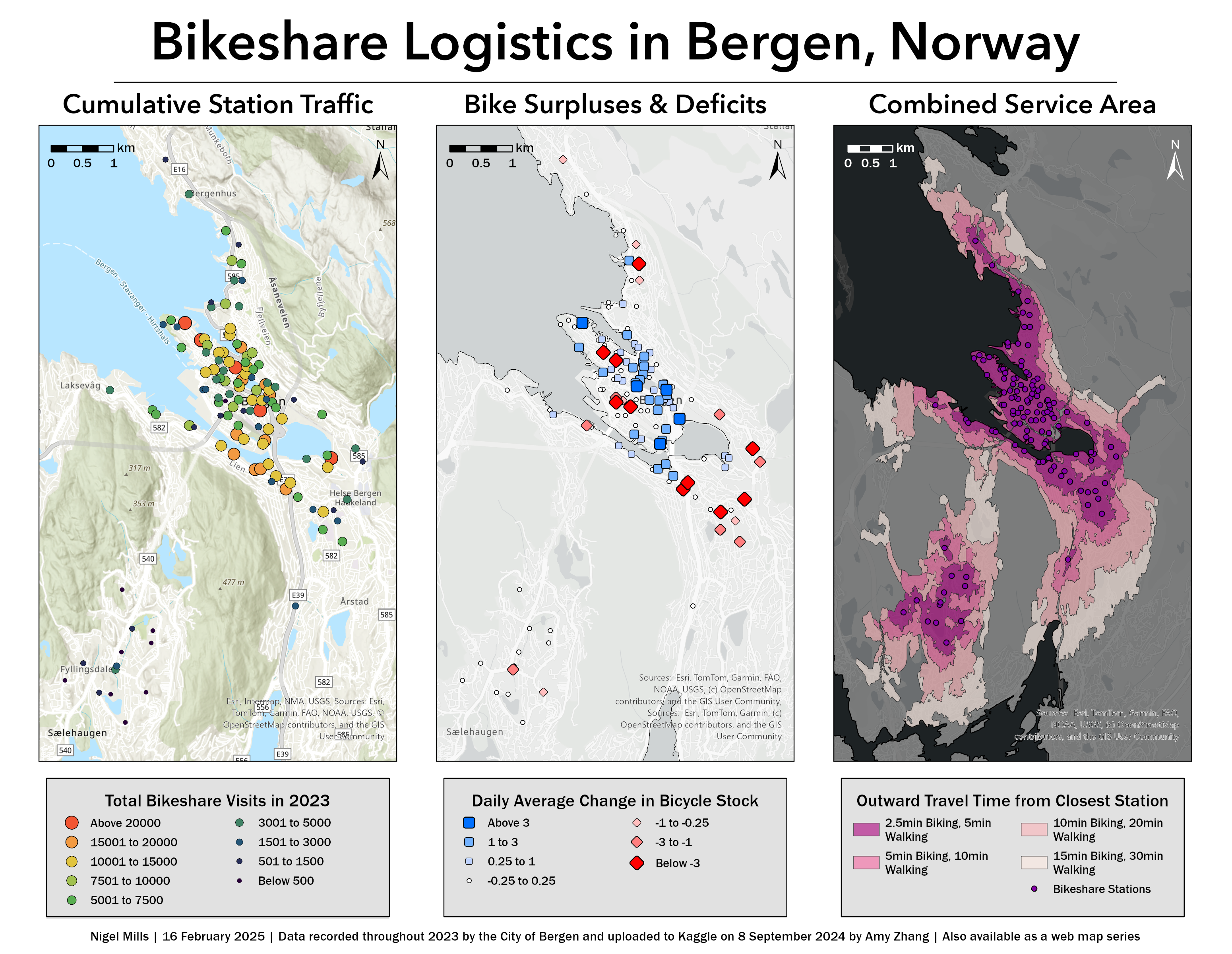
Maps and Spatial Visualizations
I was a geography major in undergrad, so my first experiences with infographics were centered around GIS and spatial data. Even outside of geographic & environmental projects, I still find myself doing frequent mapmaking, and much of my more recent work is also spatial.
Click on any of the preview images below to expand them and view them in full detail.
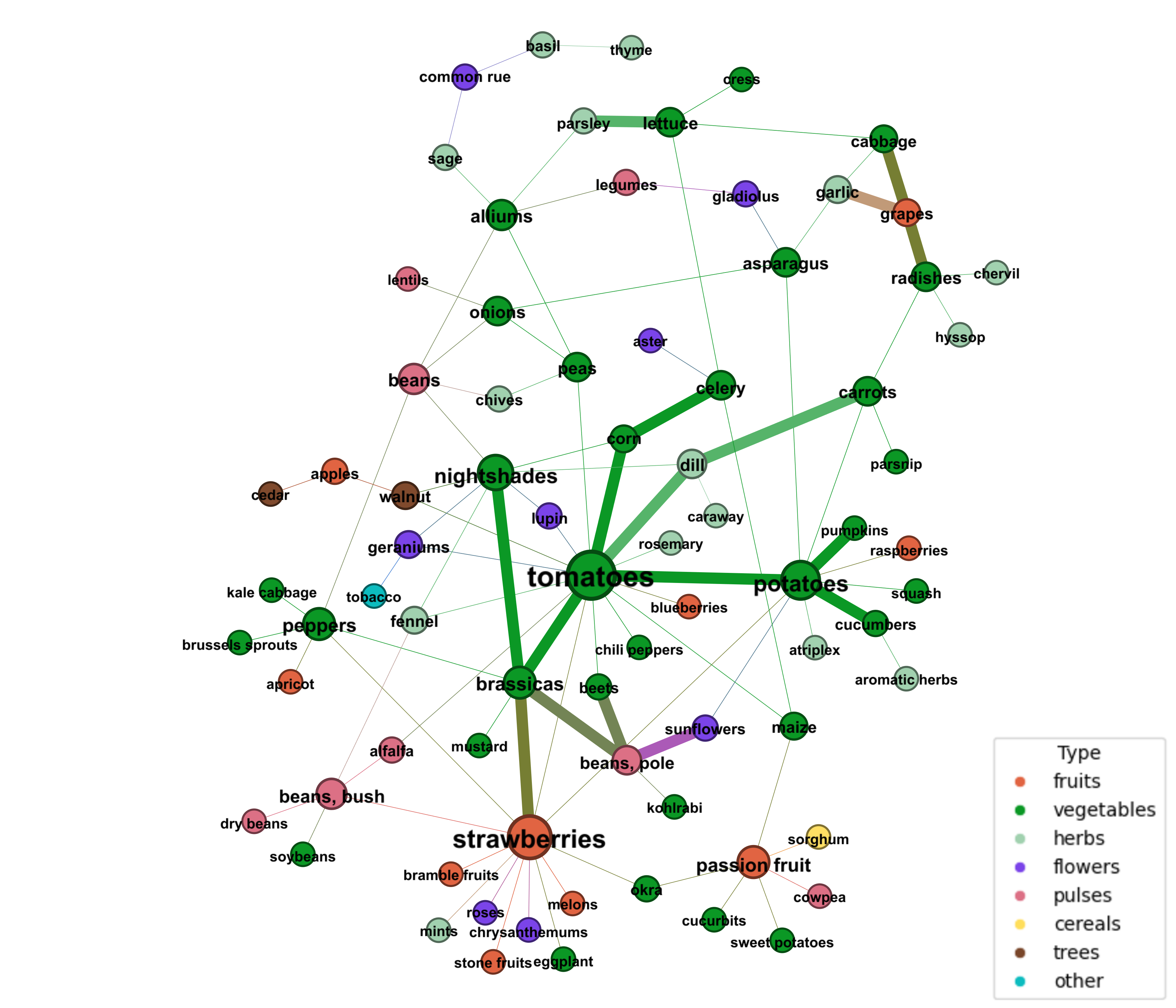
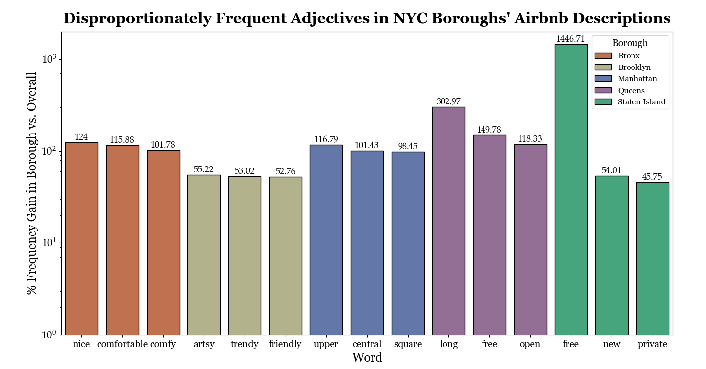
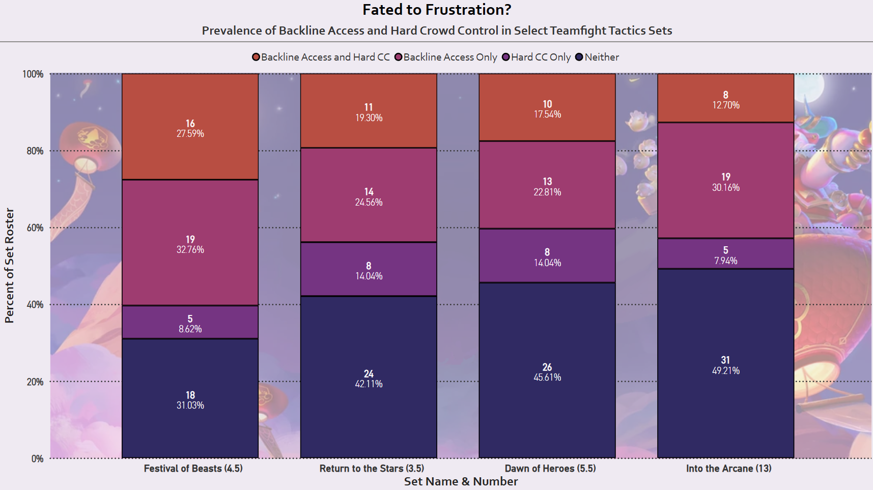
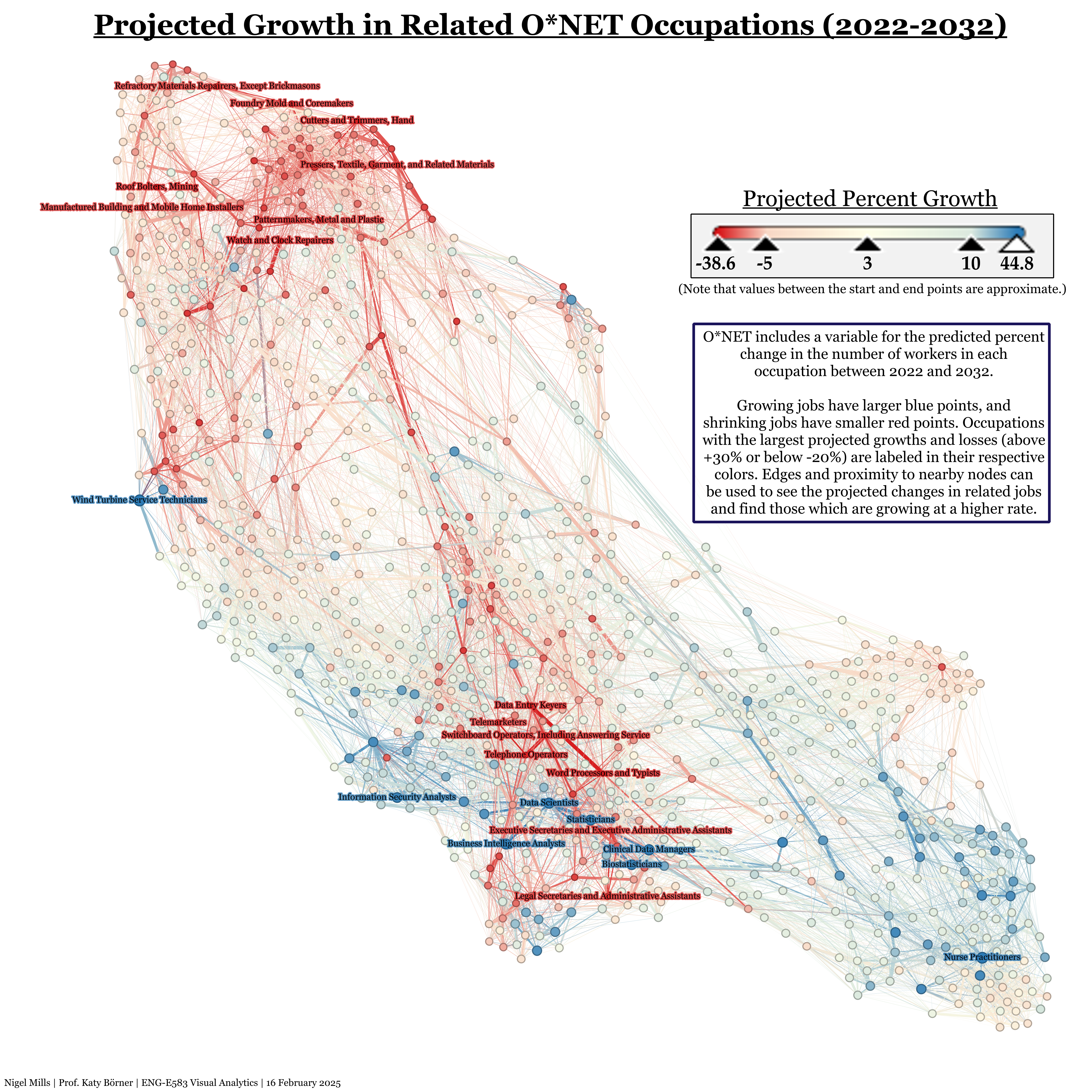
Graph, Network, and Quantitative Visualizations
Since beginning my Master's, I've also become adept at visualizing other types of data, working with a variety of languages & programs and applying the design techniques I've learned to both simple and complex visualizations.
Click on any of the preview images below to expand them and view them in full detail.
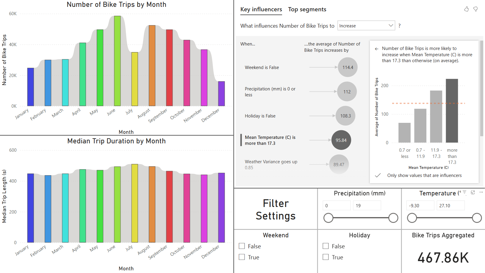
Bikeshare Power BI Dashboard
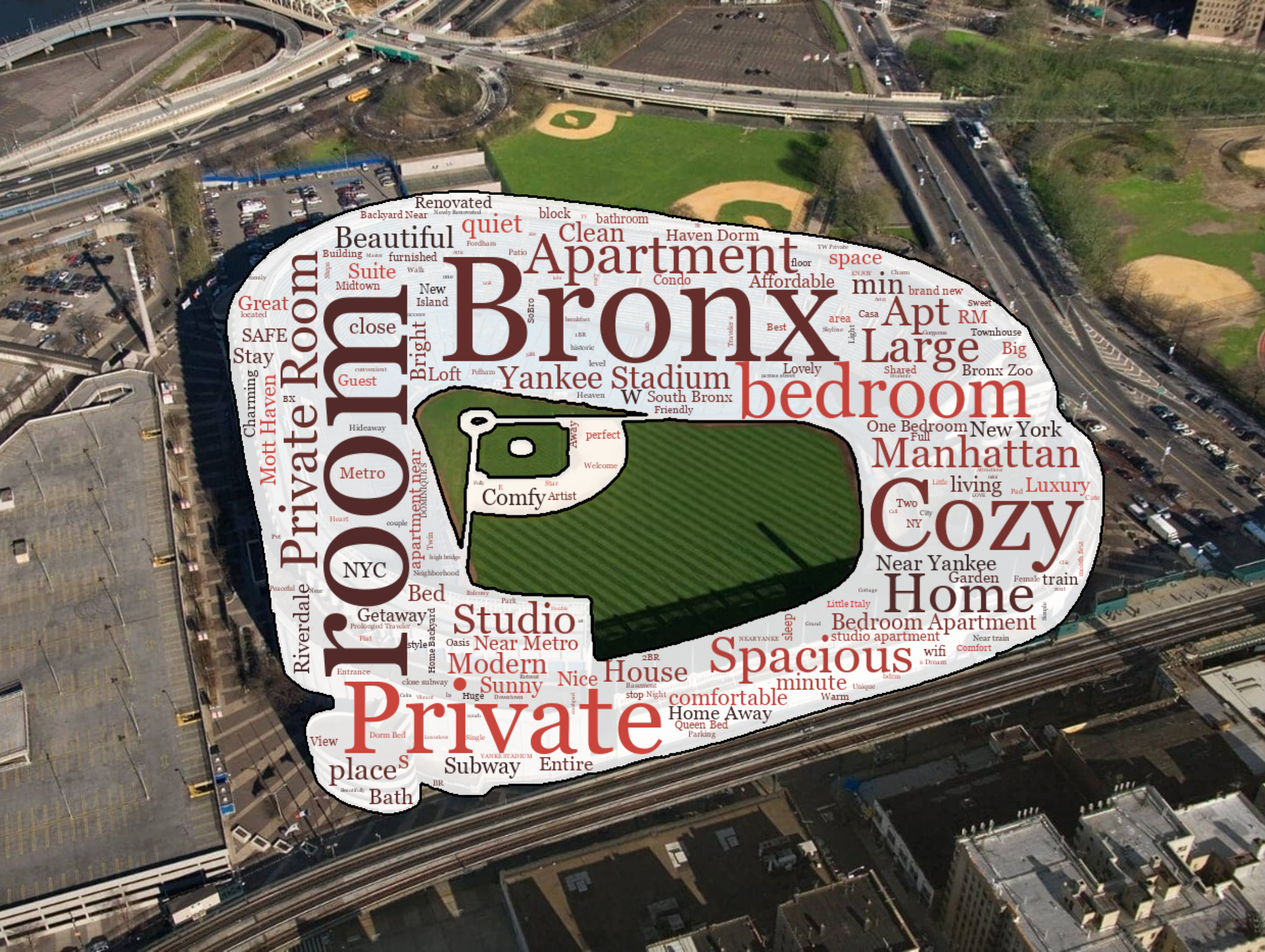
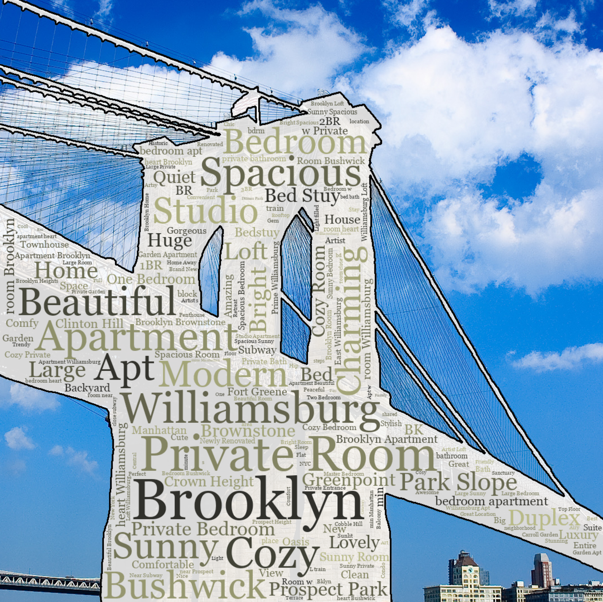
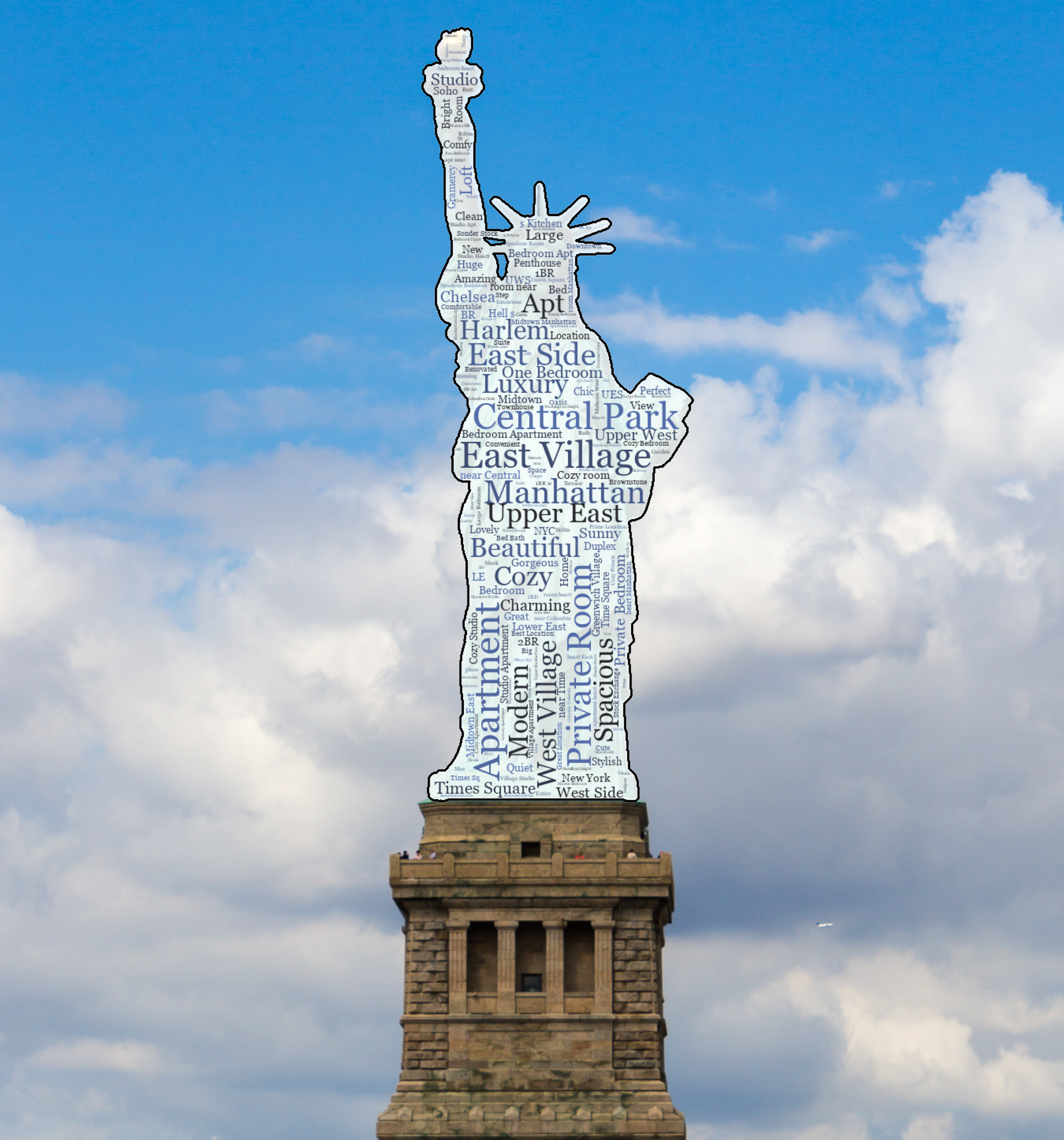
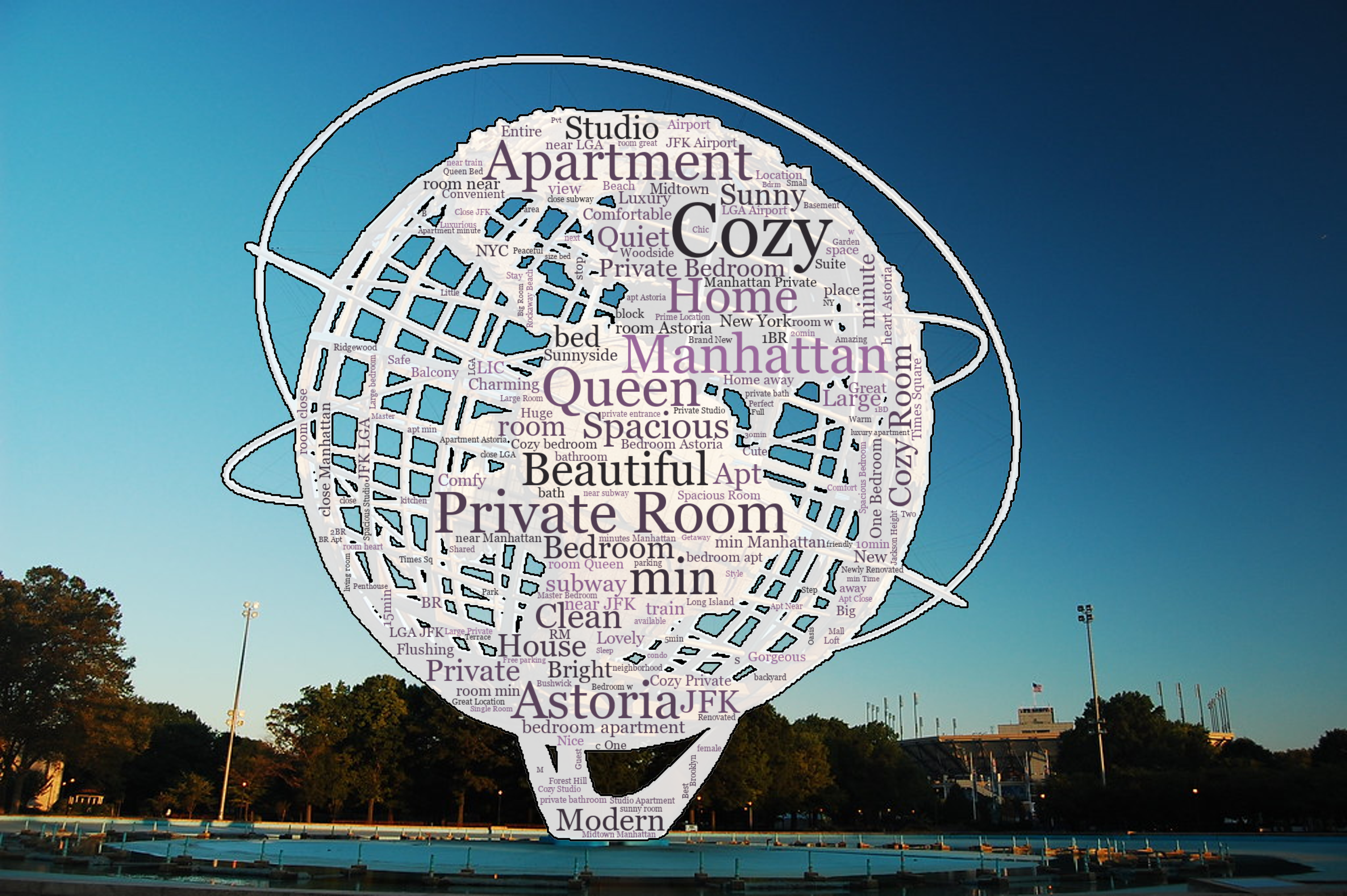
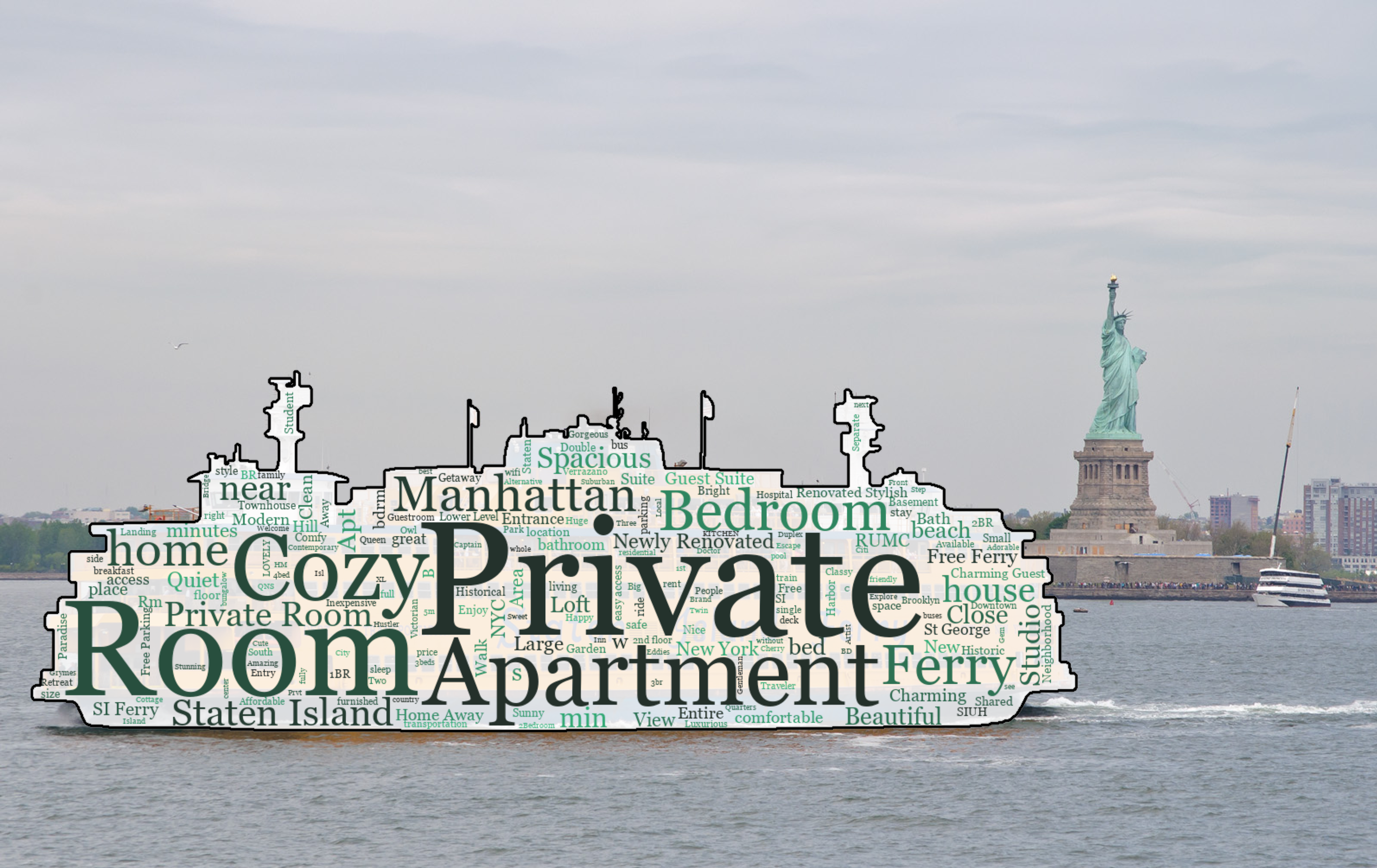
Custom Word Clouds
As part of a project for my Data Visualization course, I used natural language processing (NLP) to create a series of custom word clouds representing the most frequently-seen words in Airbnb listings within each New York City borough. To elevate them visually even beyond what is possible within Python alone, they were configured to take the shape of famous landmarks from each borough and overlaid onto photos of those landmarks. This process is replicable for any text data.
Click on any of the preview images below to expand them and view them in full detail.
Created by Nigel Mills using Silex – Last updated May 2026